



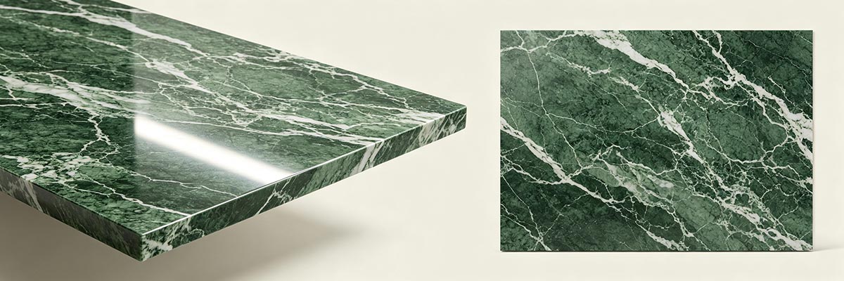
Green marble worktops can become one of the strongest visual elements in a kitchen. Their color may range from soft sage and muted olive to deep forest green, while natural veining can introduce white, grey, cream, gold, or darker mineral movement across the surface. Once the worktop occupies a large area of an island or perimeter kitchen, the surrounding design decisions need to work with that character rather than compete with it.
This is why successful green marble kitchen design is not simply a matter of finding a cabinet color or backsplash that looks attractive beside green stone. The more useful question is how each element relates to the marble in terms of color, pattern, texture, scale, and visual weight.
The actual stone should lead the decision-making process. A relatively quiet green marble can accommodate a different kitchen palette from a heavily veined slab with strong movement. Similarly, a warm green stone may interact differently with cabinetry and metals than a cooler green with blue or grey undertones.
A well-designed kitchen does not necessarily make the marble the only focal point. Instead, it establishes a clear visual hierarchy in which the worktops, cabinetry, backsplash, island, flooring, lighting, and hardware support one another.
Start With the Green Marble as Part of the Overall Kitchen Design
The most important design decision is to treat the green marble as part of the kitchen from the beginning rather than as a surface selected independently from the rest of the room.
This matters because a worktop occupies a relatively large visual field. On a substantial island, for example, the marble may be visible from several directions and under different lighting conditions. Its green tone and veining can therefore influence how the entire kitchen is perceived.
Start by looking closely at the actual marble rather than relying only on its name. Consider whether the green is light or deep, warm or cool, uniform or highly varied. Look at the contrast of the veins, the scale of the pattern, and how much movement appears across the slab.
A marble with strong directional movement naturally attracts attention. A quieter stone may function more like a sophisticated background surface. Neither is inherently better for a kitchen, but they require different relationships with the materials around them.
This is also where the visual character considered during slab selection becomes important. Understanding how the veining behaves across a larger surface can help determine how confidently other kitchen elements can be expressed. See our guide to how green marble veining changes the look of a kitchen worktop for a closer look at this relationship.
The objective is to establish a hierarchy. Ask which element should attract attention first, which materials should support it, and which details should remain quieter.
Choosing Cabinetry That Works With Green Marble Worktops
Cabinetry usually represents the largest visual area surrounding a kitchen worktop, so its relationship with the marble has a major influence on the finished design.
Light cabinetry can create a clear contrast against darker green marble, allowing the stone to become a strong focal point. White, cream, beige, and other restrained neutrals can also provide visual space around a highly patterned worktop. However, the effect depends on the undertones of both materials. A warm green marble may sit naturally with warm off-white or cream cabinetry, while a cooler stone may work better with cleaner or cooler neutrals.
Dark cabinetry produces a different effect. Deep green, charcoal, brown, or other dark finishes can create a more enveloping kitchen, particularly when the marble itself has substantial depth and variation. The challenge is controlling visual weight. If both the cabinetry and marble are very dark and visually active, the kitchen may feel heavier than intended unless lighter or more reflective elements are introduced elsewhere.
Wood cabinetry can be particularly useful when the marble contains warm mineral tones. The grain introduces texture without necessarily competing with the stone’s natural veining. But the wood species, stain, grain scale, and overall quantity matter. Highly pronounced wood grain combined with strongly patterned marble can create two competing surface languages.
The most reliable approach is therefore not to search for one universally “best” cabinet color. Instead, compare the cabinetry with the actual marble and ask whether the two materials establish a comfortable visual relationship.
If the marble carries most of the pattern, cabinetry can provide calmness. If the marble is relatively restrained, cabinetry can contribute more warmth, texture, or contrast.
Coordinating the Backsplash With Green Marble Worktops
The backsplash sits directly beside or behind the worktop, making its relationship with the marble particularly important. Because these surfaces are visually close together, differences in color, pattern, and texture become immediately noticeable.
There are three broad design approaches: continue the marble, complement it with a quieter material, or introduce a deliberate contrast.
Continuing the marble from the worktop onto the backsplash can create visual continuity and make the stone feel like an architectural element rather than simply a countertop. This approach can be especially effective when the marble has an attractive pattern that benefits from being seen over a larger area.
A complementary backsplash takes a more restrained approach. A plain or subtly textured surface can give strongly veined green marble enough visual space to remain the primary feature. The backsplash does not need to match the worktop exactly to feel coordinated.
Contrast can also work when it is intentional. A different stone, tile, or finish may create separation between the worktop and wall while still connecting through a shared undertone or material characteristic.
The important consideration is pattern competition. If the worktop already has strong movement, introducing another highly directional or heavily patterned surface immediately beside it can make the kitchen visually restless. Conversely, a quiet marble may provide enough visual room for a more expressive backsplash.
The backsplash should therefore be evaluated as part of the same composition as the worktop, not as an independent decorative decision.
Designing the Kitchen Island Around the Marble
The kitchen island often provides the largest uninterrupted area of worktop, which makes it one of the most important elements in green marble kitchen design.
The size and shape of the island affect how much of the marble’s pattern can be seen. A large rectangular island may reveal long areas of veining and movement, while a smaller or more segmented layout may produce a different visual rhythm.
The island’s cabinetry also needs to relate to the stone. If the marble is visually dominant, simpler island cabinetry can allow the worktop to carry the design. If the marble is quieter, the island can take a stronger role through cabinetry color, paneling, or carefully selected hardware.
Waterfall sides create another important relationship. When the marble continues vertically over the side of an island, the stone becomes a more substantial architectural feature and its veining becomes visible from additional viewpoints. This makes the relationship between the stone and island proportions particularly important.
The visual planning of the marble across island and perimeter worktops should also be considered alongside the overall kitchen layout. The way important areas of a slab are allocated to the island and other worktop pieces can influence how cohesive the finished room feels. Our guide to planning a green marble slab for a kitchen worktop explains this planning stage in greater detail.
The island should not automatically be made more decorative simply because it is the focal point. Sometimes its strongest design feature is the marble itself.
Selecting Flooring That Does Not Compete With the Worktops
Flooring occupies a large horizontal area, but it is usually farther from eye level than the worktops. Its role in the composition is therefore different from cabinetry or backsplash materials.
Color is the first consideration. Flooring does not need to match the green marble, but its undertone should not create an unintended conflict. Warm natural materials can reinforce warmer marble tones, while cooler flooring can help maintain a cleaner palette around cooler green stone.
Pattern and texture are equally important. A strongly veined marble worktop paired with highly patterned flooring introduces visual activity in two large areas of the kitchen. That can work in an intentionally layered interior, but it requires greater control elsewhere.
More restrained flooring can provide a visual foundation beneath a highly expressive worktop. Conversely, if the marble is relatively quiet, flooring may contribute more texture or character without overwhelming the room.
Scale matters as well. Large-format flooring, narrow boards, patterned tiles, and heavily textured surfaces create very different visual rhythms. The right choice depends on the size of the kitchen and the visual strength of the other materials.
Rather than asking whether a particular flooring material is “best” with green marble, consider whether the floor supports the worktop or introduces another dominant pattern that the rest of the kitchen must compete with.
Using Lighting to Reveal the Character of Green Marble
Lighting can change how green marble is perceived throughout the day. The same surface may appear softer under natural daylight, deeper under evening illumination, or more contrasting when directional light catches the veining and surface texture.
Daylight should therefore be considered early in the design. The direction and amount of natural light entering the kitchen can influence how the green tone appears and how strongly the veins are perceived.
Ambient lighting establishes the overall atmosphere, while task lighting needs to illuminate the areas where food preparation and other activities take place. Under-cabinet lighting is particularly relevant because it places illumination close to the worktop and can alter the apparent depth and contrast of the stone.
Island lighting also affects how the marble is read. Pendant fixtures introduce both light and visual mass above the island, so their size, spacing, shape, and finish need to work with the stone below rather than becoming an unrelated focal point.
Lighting should be judged using the actual marble whenever possible. A digital image or small sample may not show how the green changes under different conditions. For a substantial project, viewing the material in representative lighting can provide a much more reliable design reference.
The goal is not simply to make the worktop brighter. It is to reveal its natural color, movement, and surface character while maintaining a comfortable overall kitchen environment.
Choosing Hardware and Metal Finishes
Cabinet handles, faucets, appliances, and other visible metal details may occupy less surface area than the worktop or cabinetry, but they contribute to the overall visual language of the kitchen.
Warm metals can reinforce warmer undertones in the marble and surrounding materials. Dark finishes can create stronger definition against light cabinetry, while polished or reflective metals can introduce brightness into a darker composition.
The right choice depends on the entire palette. A faucet should not be selected solely because a particular metal looks attractive beside the marble in isolation. It should also relate to the cabinet hardware, appliances, lighting fixtures, and other visible metal elements.
Consistency can help create cohesion, but perfect matching is not always necessary. A kitchen can successfully combine different finishes when the differences appear intentional and the overall visual weight remains controlled.
Again, the actual marble matters. A green stone containing warm cream or golden mineral features may provide a natural connection to warmer metals. A green marble with grey or blue undertones may create a different relationship.
Hardware is most successful when it reinforces the existing composition rather than attempting to become another major focal point.
Creating Visual Balance Around Green Marble
Once the major materials have been selected, the final question is how they behave together.
Visual balance does not mean making every element equally noticeable. In fact, a kitchen often becomes more coherent when different materials are given different levels of visual importance.
If the green marble has dramatic movement, it may already provide enough pattern and contrast for the room. Cabinetry, flooring, and backsplash can then provide areas of visual rest. If the marble is relatively quiet, other elements can carry more texture or definition.
Color is only one part of this balance. Pattern, texture, scale, reflectivity, and visual weight all influence how the kitchen feels.
For example, a pale cabinet finish may appear visually light, but a highly detailed door profile can make it more active than a simple flat-front cabinet. A neutral backsplash may still attract attention if it has strong texture. Dark cabinetry may dominate a room even when its surface is completely plain.
This is why successful green marble kitchen design cannot be reduced to a formula such as green marble plus white cabinets or green marble plus wood. Those combinations can work, but their success depends on the particular marble and the other materials surrounding it.
A useful way to evaluate the finished palette is to ask four questions:
What is visually dominant?
This may be the marble, the island, the cabinetry, or another architectural feature.
What supports that element?
Supporting materials should reinforce its color, scale, texture, or visual character.
What competes with it?
Competing patterns and strong finishes are not necessarily wrong, but there should be a reason for their presence.
What connects the different elements?
Shared undertones, textures, materials, shapes, or metal finishes can create continuity across the room.
This framework is more reliable than selecting each material independently.
Let the Marble Set the Level of Visual Competition
Designing a kitchen around green marble worktops is ultimately less about finding one universally correct combination and more about controlling the relationship between natural stone and everything around it.
The marble should be considered as a material with its own color variation, movement, undertones, pattern scale, and visual weight. Those characteristics should guide the decisions that follow. Cabinetry can provide contrast or calmness. The backsplash can continue, complement, or deliberately contrast with the stone. The island can emphasize the marble’s scale. Flooring can establish a quiet foundation. Lighting can reveal changes in color and veining, while hardware can connect the individual elements.
The strongest result is not necessarily the kitchen with the most decorative features. It is the one in which the materials have a clear relationship and no single element is competing without purpose.
For that reason, the best approach is to let the character of the actual green marble worktop determine how much visual competition the rest of the kitchen can carry. A dramatic stone may need restraint around it. A quieter stone may allow greater expression elsewhere. Once that relationship is understood, the rest of the kitchen becomes much easier to design with confidence.
Post time: Sep-07-2026